Indy Red
Indy Red
Intro
How do you fuel equity in the sport of Ultimate frisbee?
With a brand identity designed to light the fire for change.
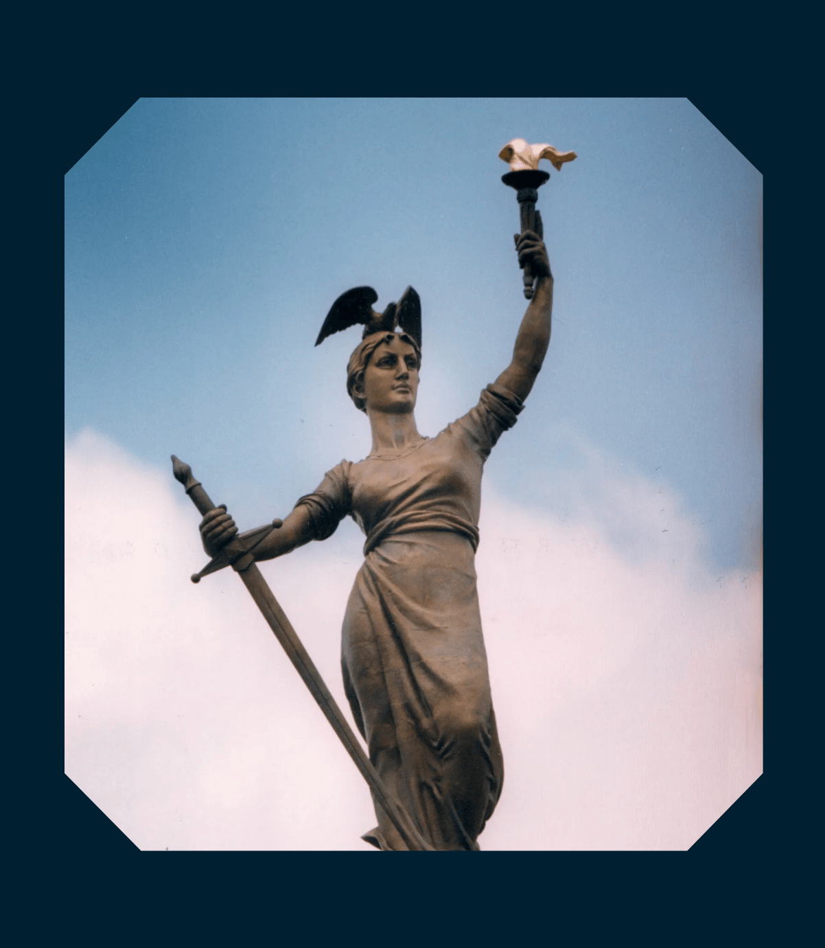
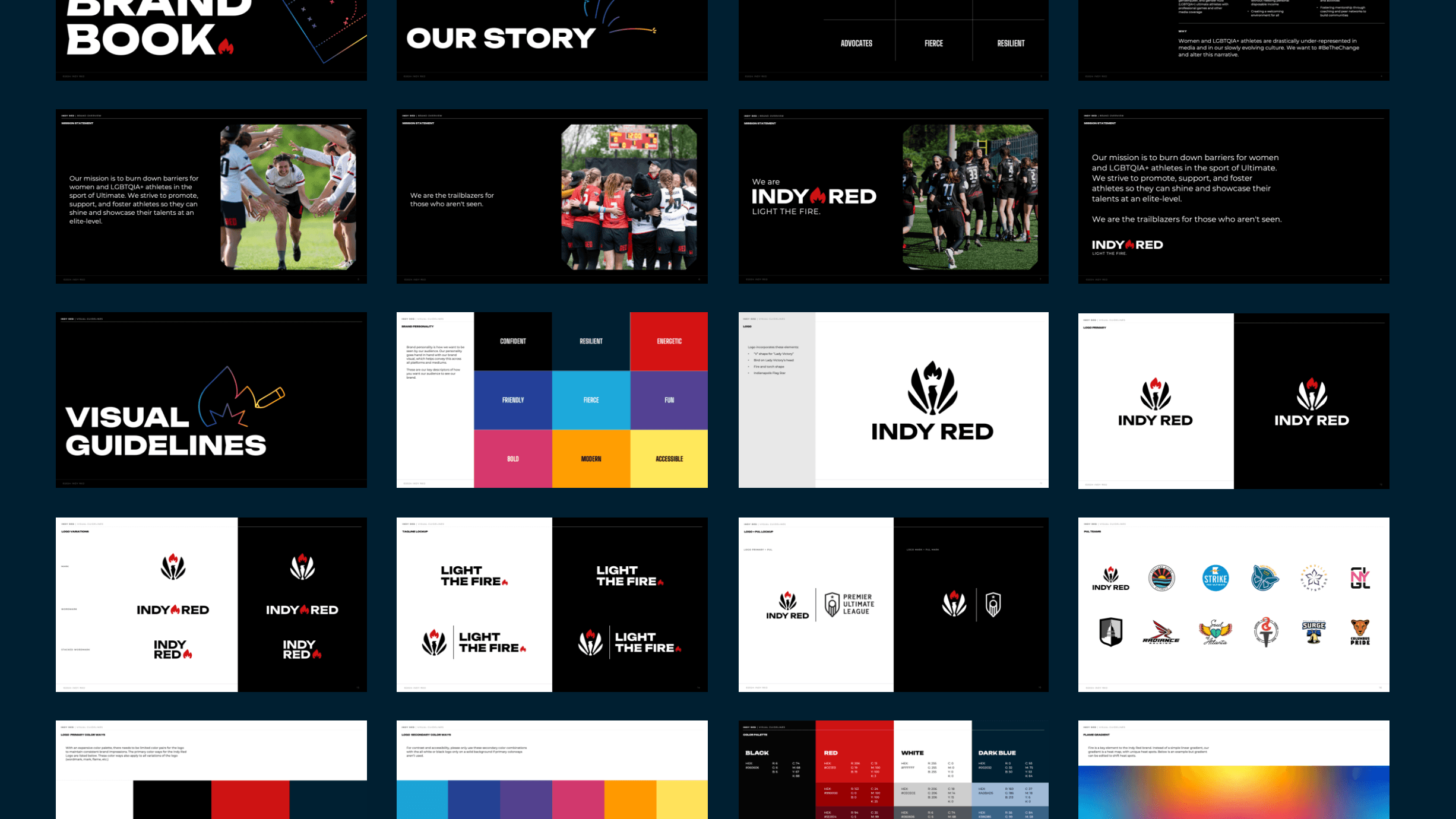
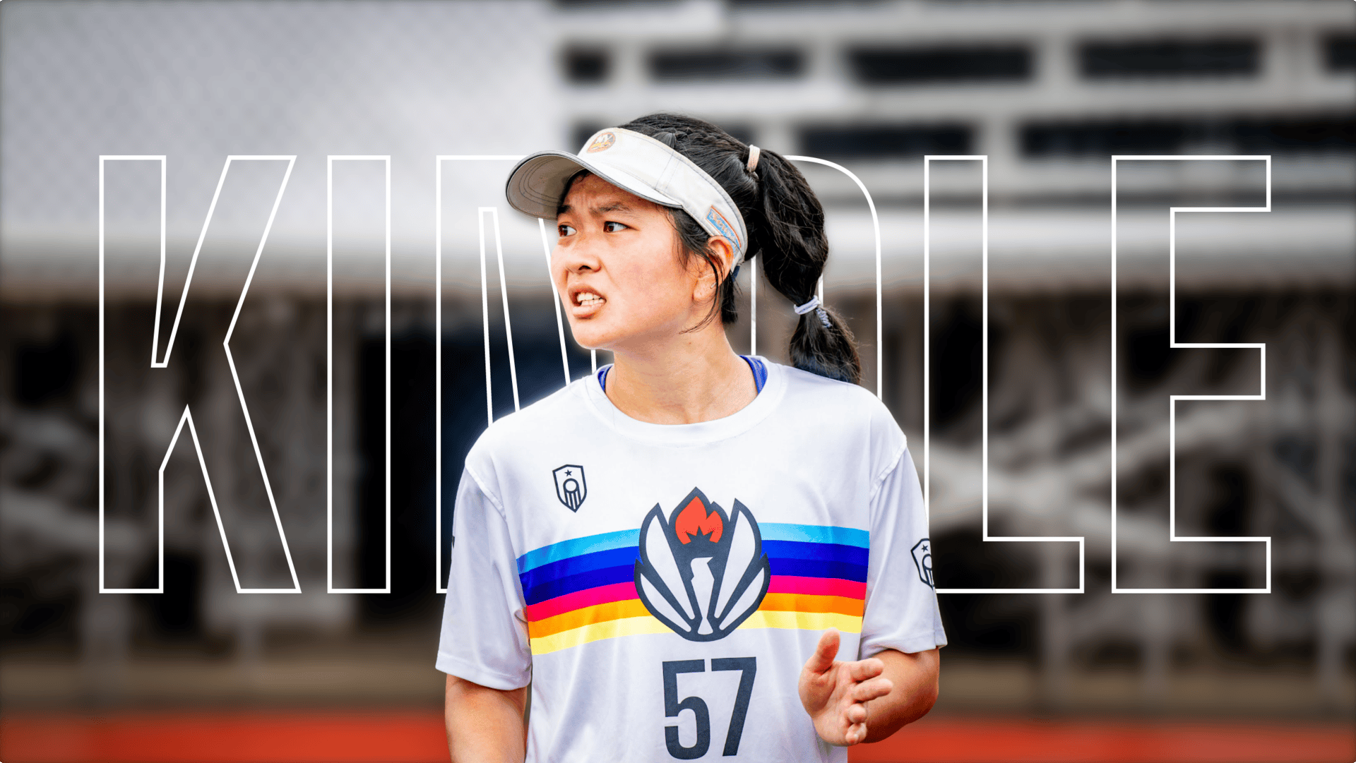
Indianapolis (Indy) Red is a professional ultimate frisbee team and part of the Premier Ultimate League (PUL). Since the PUL’s inaugural 2018 season, Indy Red has burned down barriers for women and LGBTQIA+ athletes in the sport of ultimate, becoming an icon within the community for their advocacy. They strive to promote, support, and foster athletes so they can shine and showcase their talents at an elite level. Being trailblazers in the ultimate community, Indy Red needed a brand identity that matched their flame and mission.
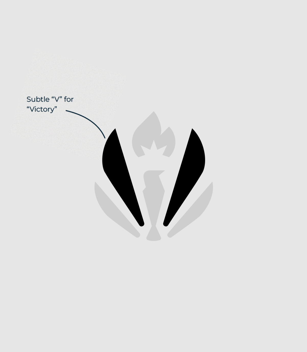
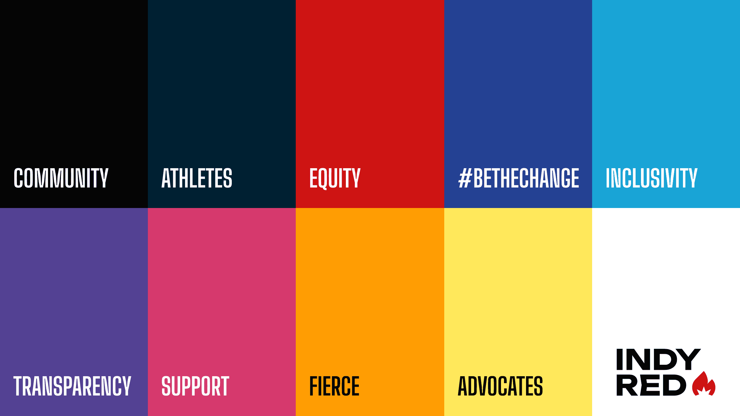
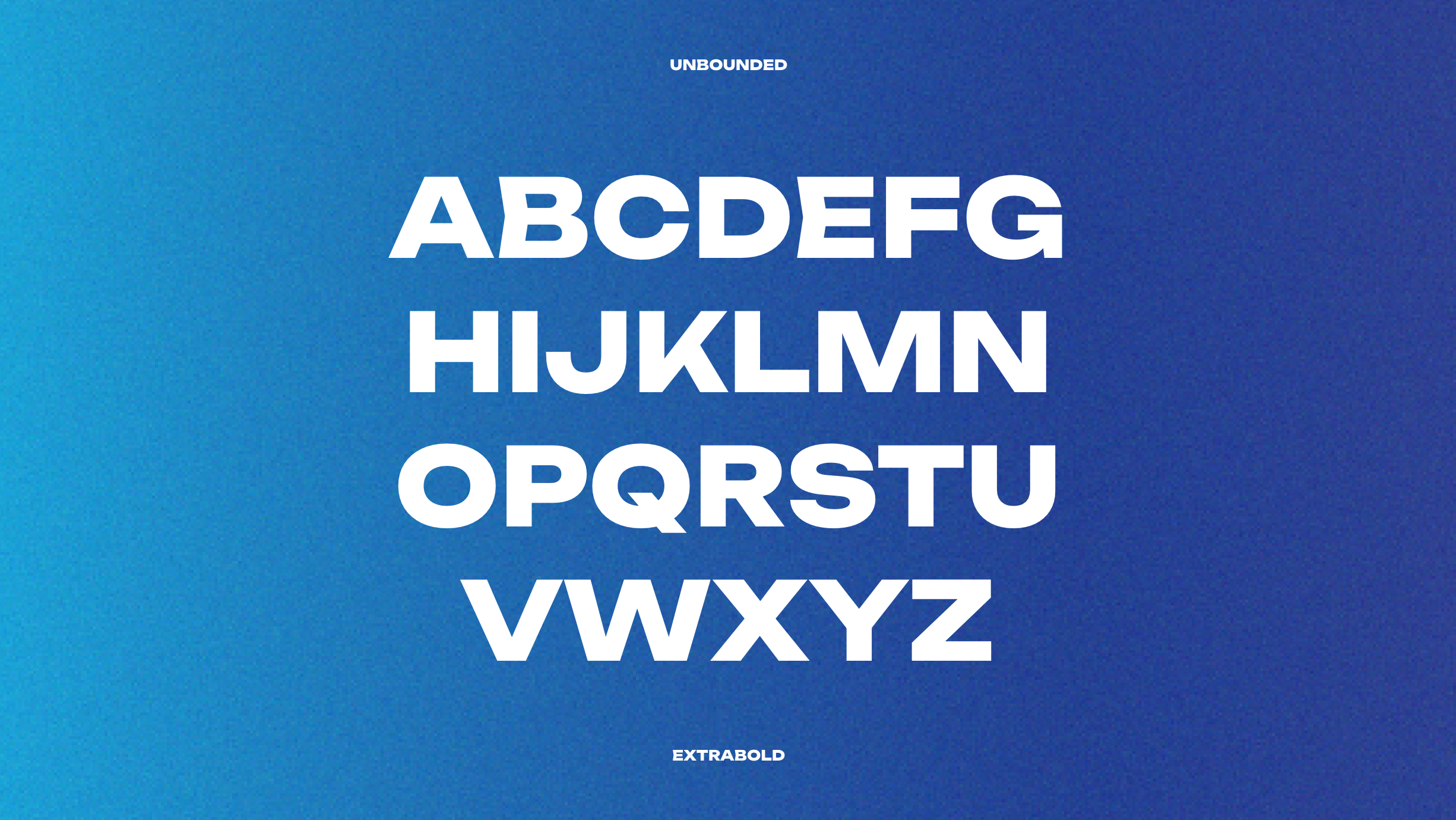
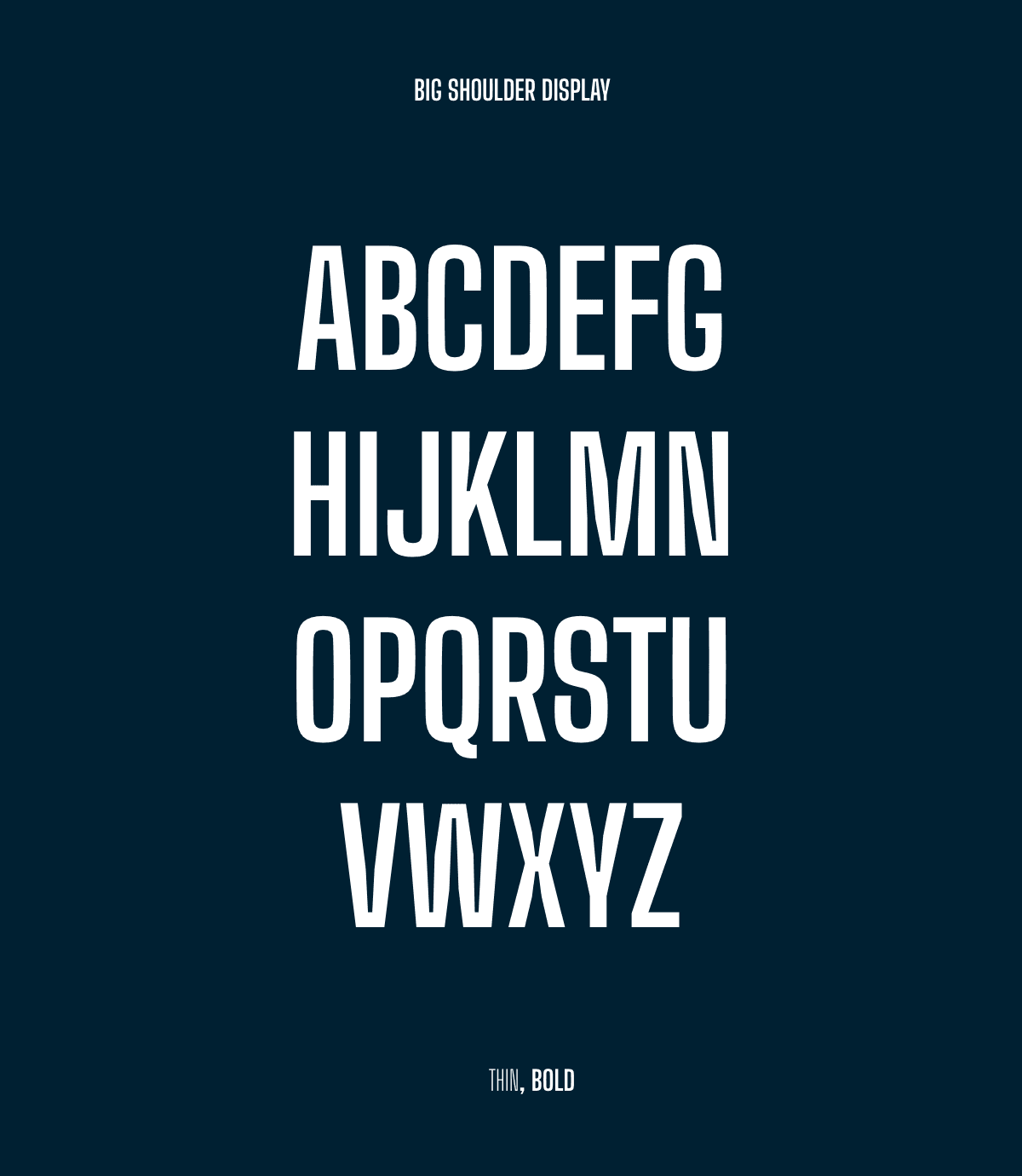
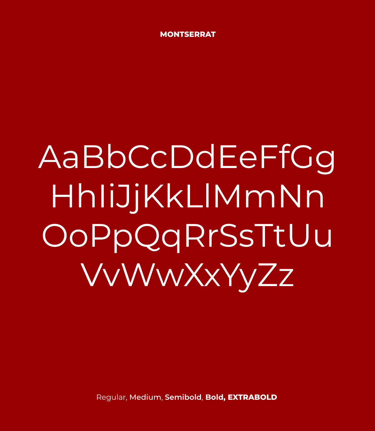
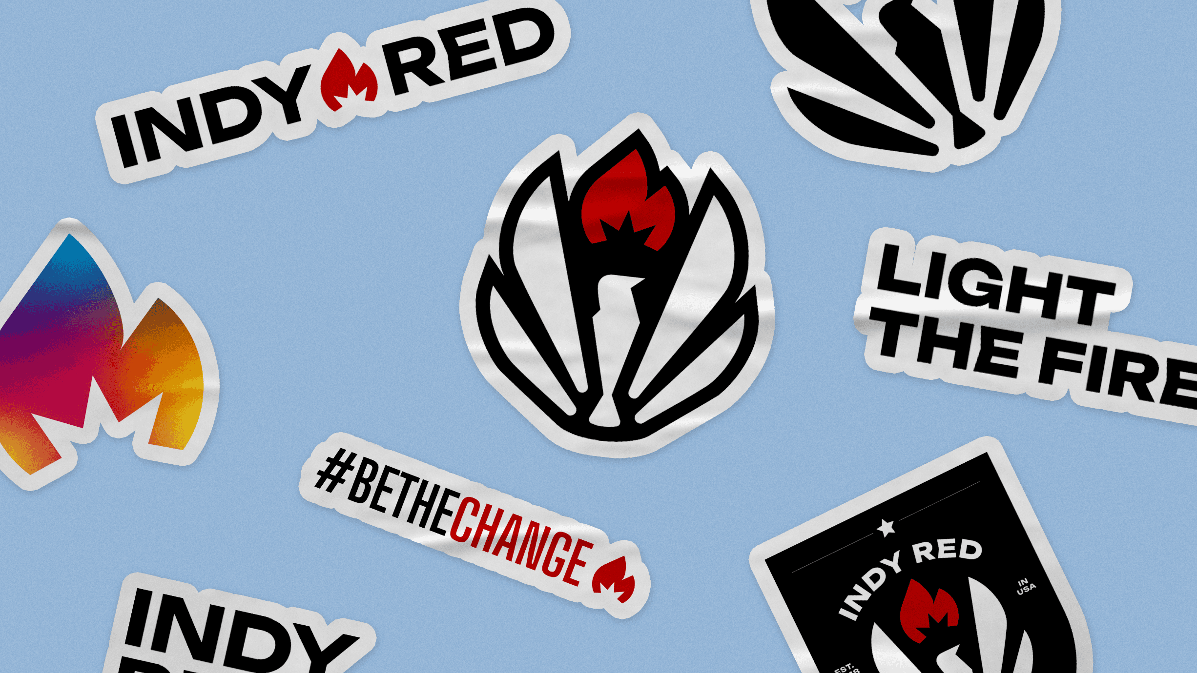
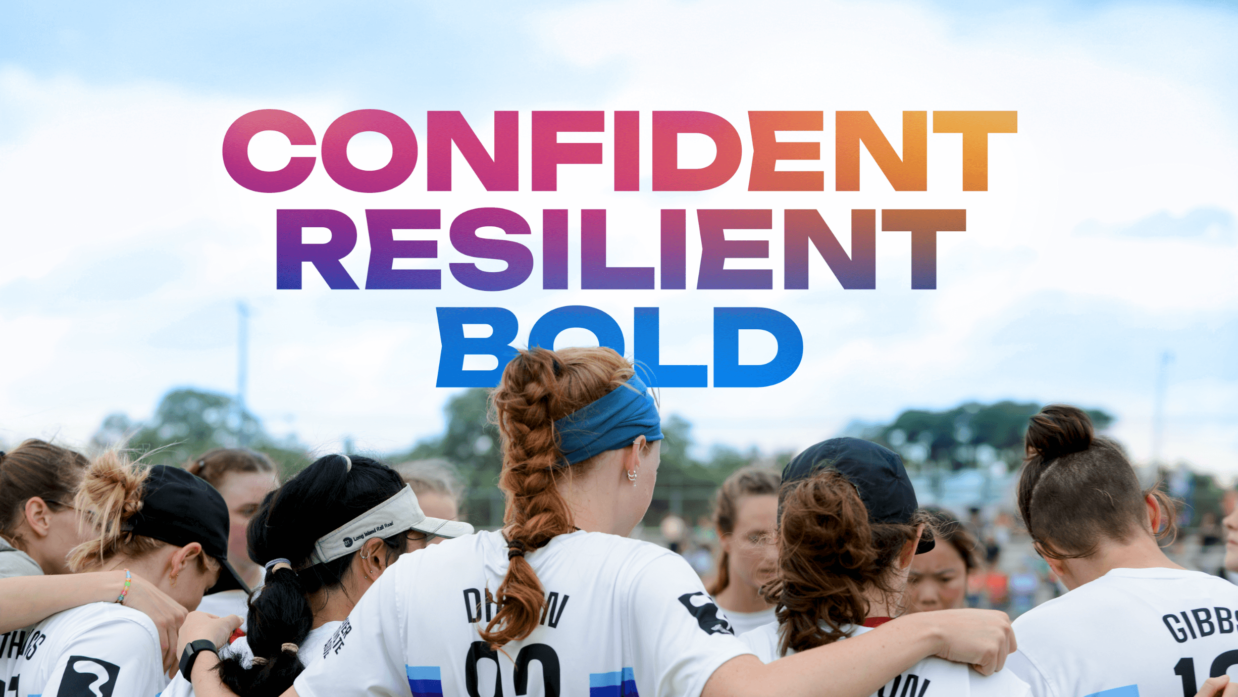
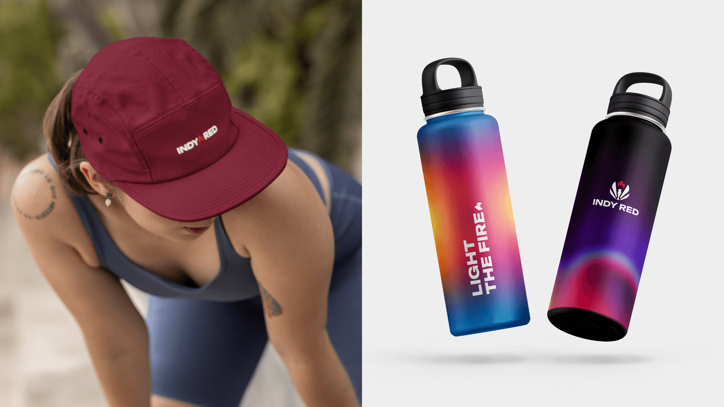
Thus began this brand refresh—from a new logo and visual systems to unifying brand language and mission—centered around lighting the fire for change. Keeping Indy Red’s name and Lady Liberty flame motif, this brand system encapsulates the energy, motion, and vibrancy of fire and the change it brings. Dynamic heat map gradients and colors paired with expressive typography create a bold but balanced intensity to the brand, while hand-drawn elements add a sense of playfulness and alluded to in-game plays of ultimate.
As an ultimate player and Indy Red alum*, it was such a privilege and honor to create this brand identity. I cannot thank Jackie Lai and the Indy Red team enough for the collaboration and trust they had in my vision and creative direction.
*I made the 2021 team but missed out on the season due to moving to NYC that year :’)
Services:
Branding
Copy Writing
Creative Direction
Web Design
Credits:
Joe Harrison, Matt Bradford & Don Mennig (Photography)
Intro
How do you fuel equity in the sport of Ultimate frisbee?
With a brand identity designed to light the fire for change.
Indianapolis (Indy) Red is a professional ultimate frisbee team and part of the Premier Ultimate League (PUL). Since the PUL’s inaugural 2018 season, Indy Red has burned down barriers for women and LGBTQIA+ athletes in the sport of ultimate, becoming an icon within the community for their advocacy. They strive to promote, support, and foster athletes so they can shine and showcase their talents at an elite level. Being trailblazers in the ultimate community, Indy Red needed a brand identity that matched their flame and mission.
Thus began this brand refresh—from a new logo and visual systems to unifying brand language and mission—centered around lighting the fire for change. Keeping Indy Red’s name and Lady Liberty flame motif, this brand system encapsulates the energy, motion, and vibrancy of fire and the change it brings. Dynamic heat map gradients and colors paired with expressive typography create a bold but balanced intensity to the brand, while hand-drawn elements add a sense of playfulness and alluded to in-game plays of ultimate.
As an ultimate player and Indy Red alum*, it was such a privilege and honor to create this brand identity. I cannot thank Jackie Lai and the Indy Red team enough for the collaboration and trust they had in my vision and creative direction.
*I made the 2021 team but missed out on the season due to moving to NYC that year :’)
Services:
Branding
Copy Writing
Creative Direction
Web Design
Credits:
Joe Harrison, Matt Bradford & Don Mennig (Photography)